
(Click on the image to zoom in)
Pre-production: Planning
Crew roles
| Member | Roles |
| Nguyen Ky Dan (me) | Costumes design Location scout Sound design Animation |
| Nguyen Khac Hai Linh | Shot list Camera operator Editor Film producer |
Costumes
Costume #1

Front 
Side 
Back
Costume #2

Front 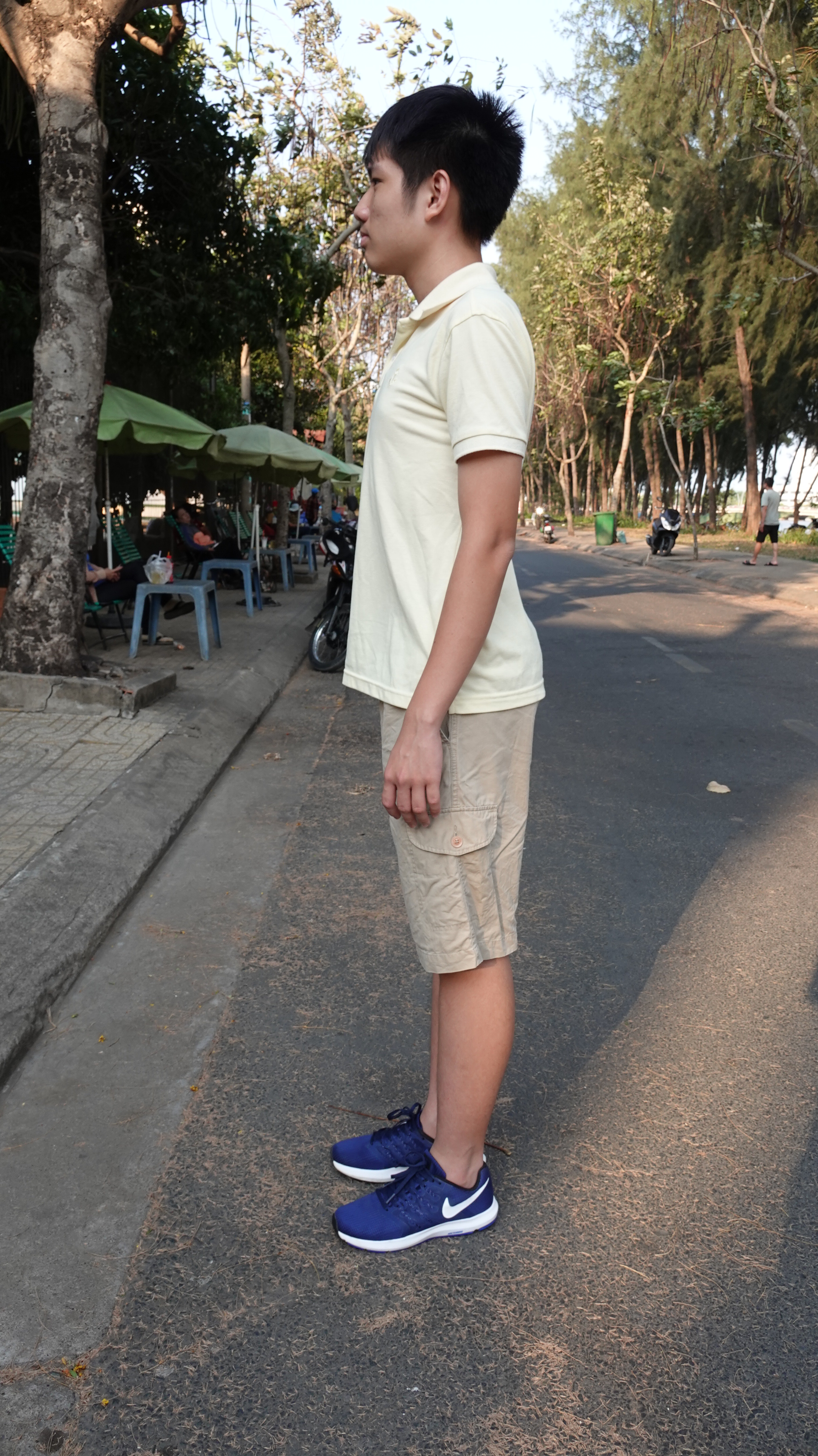
Side 
Back
Description: Dark red and cream yellow polo shirt, dirty yellow shorts, black socks, and dark blue trainers.
Purpose: Dark red colour and cream yellow makes the boy stand out from the background (puts all the focus on the main character), but also expresses vulnerability as the boy can be easily seen. Shorts and trainers are typical cloth wears for a kid, conveying innocence.
Costume #3

Front 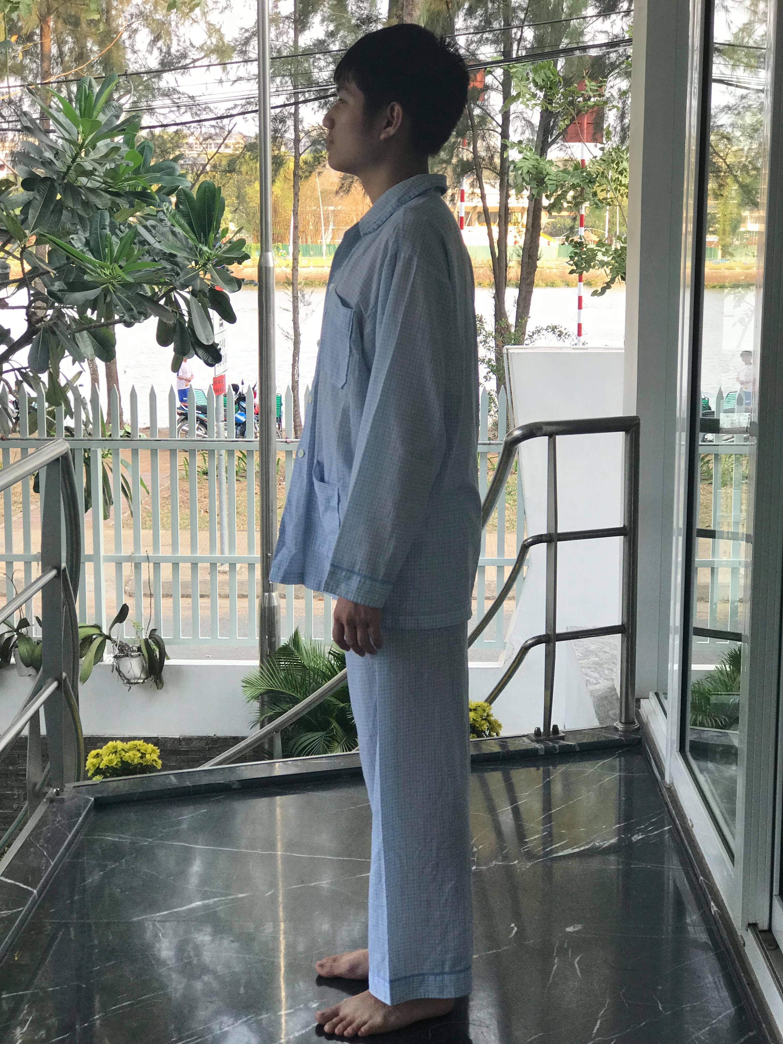
Side 
Back
Description: Light blue pyjama with long sleeve and long pants.
Purpose: The pyjama connotes calmness and the state of being at ease, showing that the boy feels safe in his home, which is when this costume is in use. However, being at ease also means being vulnerable, which is simultaneously conveyed.
Locations
Location #1


Grass field, about 50m from the British Vietnamese International School Ho Chi Minh City. We decided to use this location as it is bear and isolated, which is what we want to use to create an unsettling atmosphere. The eerie sun also adds onto the uneasiness, as the abnormality of a bright setting in a thriller/horror film would make the audience feel nervous.
Location #2


Ong Lon River, Ho Chi Minh City. We chose this location as it is right in front of my house (which is another location we are using), which would make the filming process much more quick and effective. In addition, the calm river and tall, green tree give off a peaceful atmosphere, where the protagonist feels safe and at ease. The presence of a peaceful setting in a horror/thriller film would also help to unsettle the audience and build up the tension and suspense.
Location #3


My house. We have decided to go with my house as it is airy and ‘opened’, which would again give off the tranquil and pleasant aura. The fact that it is my house would also, as already mentioned, make the filming process a lot easier.
Pre-production: Initial ideas
Overview
Film name: ‘Noah’
Genre: Drama, art-house
Age rating: PG
Target audience: male and female, 15+
Plot
Noah, who suffers from mental illness, struggles to find himself in a neglecting society. A nature-loving boy, he feels at peace in nature, and finally decides to leave his house and sets off to explore the world and challenges around him.
Production company logos
To further prepare for our coursework, I have conducted researches on the design of iconic production companies’ logos and their animations played before the start of every film. Hopefully, by taking inspirations from some of these logos, we can produce a production company logo of our own for our opening title that can effectively reflect the styles of our work.
Walt Disney Pictures

Then 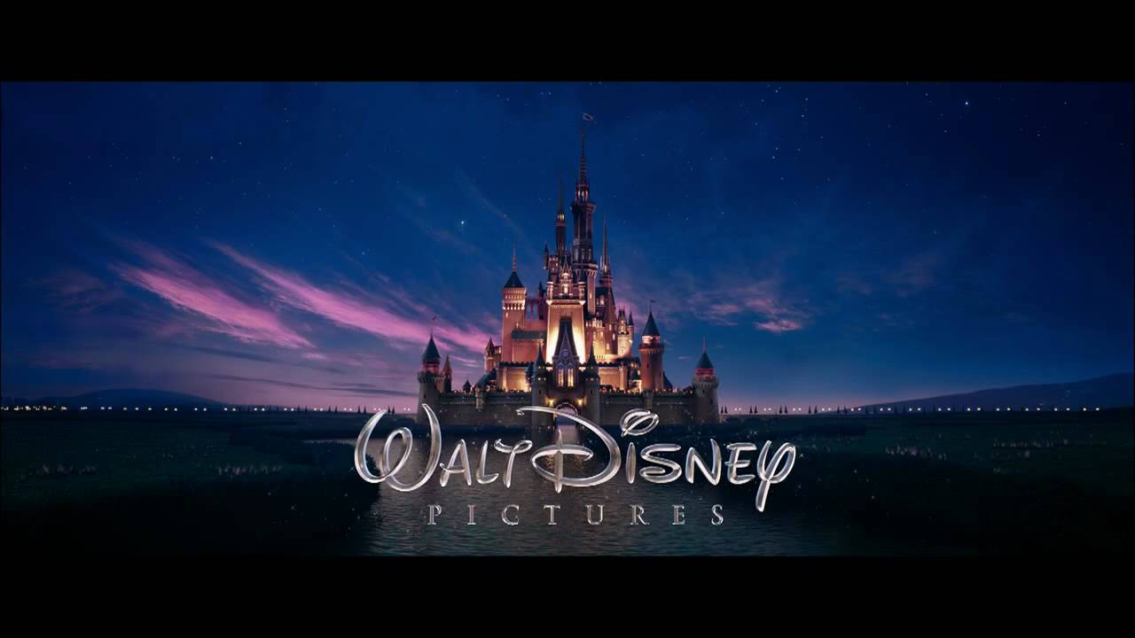
Now
Our favourite film as a kid was probably a Disney film. Known for their witty characters, intriguing stories and iconic music scores, Walt Disney Pictures had produced numerous successful films that have transcended through generations.
Before, their opening animation consisted of a blue background with that castle along with the magical ‘Walt Disney Pictures’. Recently, the company had changed this into a 3D animation sequence with the addition of fireworks and that iconic music track. However, the castle and the ‘Walt Disney Pictures’, with the same font, still appears on our screen today. This is because it perfectly reflects the beauty and magic of Disney films, and is a symbol that has represented, and will forever represent, Walt Disney Pictures and its quintessences; removing it would mean removing the company’s own identity.
Universal Pictures

Then 
Now
Another famous production company. Their iconic opening animation involves a spinning globe with a looming ‘Universal’ revolving around. This imagery, along with the epic music score, gives the audience an overwhelming excitement before the film starts. This could be a stretch, but this logo could also suggest that all Universal’s films are ‘out of this world’, both figuratively and literally, as many their most successful films were set in fictitious worlds and/or characters (e.g. E.T., Jurassic Park, King Kong). And, for the same reason as with Walt Disney Pictures, Universal Pictures had, probably will, never attempt to stray away from the globe imagery, despite numerous changes and tweaks since they were founded.
DreamWorks Animation

Then 
Now
There aren’t many animated films out there better than DreamWorks’. The image of the boy sitting on the moon fishing is nostalgic and picture-perfect, which effectively serves its purpose to this very day: to remind others of Hollywood’s golden age. It is also a suitable logo for this production company; even if you have never heard of DreamWorks before, you would still know, after seeing this opening animation, that you are going to watch an animated film. The DreamWorks Animation logo reminds us that what matters the most about a logo is not the looks but the idea behind it: give the audience a simple and yet original logo, and your films will be remembered forever.
20th Century Fox
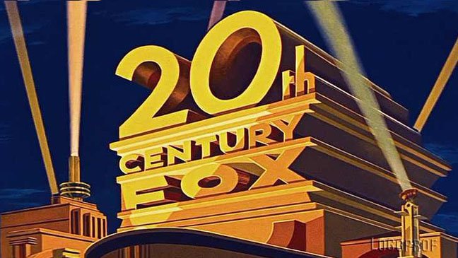
Then 
Now
Ask anyone to recite an opening theme to a film and they’ll most probably hum out the tune of 20th Century Fox’s. When talking about music scores for opening animation, no production companies beat 20th Century Fox; one can only think of films upon hearing the orchestral piece. Unlike the other companies mentioned, there are no castles, globes or moons in this logo; it is simply a big, gold-painted ’20th Century Fox’. However, this does not make it any less memorable than the others. This logo has shown just how ‘free’ logo designing is: you really do not need to take lessons from others, as there are so many opportunities for your own original and creative inputs.
20th Century Fox’s logo has not really changed a whole lot through the years. But then, again, does it really need to?
Exclusive logo changes for films
Sometimes, production companies tweak their their logos in the opening animation to suit the atmosphere of the films they are showing and set the mood right from the start. For example, in the ‘Diary of a Wimpy Kid’ films, 20th Century Fox decided to change their opening theme to hand-drawn, similar to what you would see in a diary:

Another example is how Warner Bros. Pictures’ opening animation throughout the ‘Harry Potter’ series changes for every film. A noticeable trend is that the subsequent theme becomes ‘darker’ than the last, as Harry and his friends have grown up and the Wizarding World was becoming a more dangerous and sinister place:

Opening titles
As part of our research towards the coursework, I have looked for some opening titles from horror/thriller films for inspirations and ideas.
The Conjuring (2013)
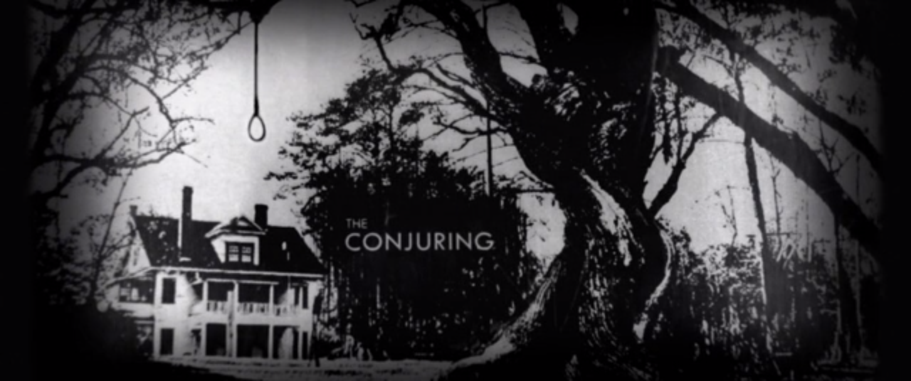
The opening title begins with a series of photos. These photos were in black and white to provoke a sense of mystery. The loud and echoing non-diegetic noise unsettles the audience. Some of the pictures in the opening title were edited such that the black and white colours were distorted (e.g. the newspaper article with black paper and white words); this irritates the audience’s eyes and creates an ominous feeling. In addition, most of the photos were intentionally made blurry to make sure the face of the people in them could not be seen, which furtherly builds up the sense of mystery and menace. The texts and superimposes in this opening title were also edited to look like they were actually printed onto the newspaper articles in the background; I especially like this as it kept the text from popping out too much, which could’ve distracted the audience from the more significant things the opening title was trying to show.
Watch the opening title of ‘The Conjuring’
Se7en (1995)

An iconic thriller with an even more iconic opening title. The non-diegetic noise played in the very first second bombards the audience’s hearing sense, generating a feeling of shock. Almost all of the shots in the opening credits are extreme close-ups. This unsettles the audience as it seems to put them ‘too close’ to the actions. The credits and superimposes were edited in such a way to look flashy and distorted, traumatising the audience optical sense this time. The way Se7en’s opening credits were meticulously edited has made it become one of the masterpieces in the film industry history: an opening title capable of upsetting and overwhelming one’s all 5 senses, which sets them up mentally for the main actions to come.
Watch the opening title of ‘Se7en’
To Kill A Mockingbird (1962)

Though not a thriller nor a horror film, the opening title to ‘To Kill A Mockingbird’ has some interesting camera shots and editing techniques that I could, potentially, be able to use when filming and producing my own opening title. The film begins with a shot of someone opening a box, filmed from directly above the box. This camera angle is effective in helping the audience feel more engaged as it, in a way, puts them in the POV of the character opening the box. The transition between shots is also interesting; the editor had decided to fade the previous shot into the next shot, which helps with the continuity and prevents the whole opening title from feeling a series of mismatched shots. Furthermore—even if this does not look like the director’s intention in this opening title—filming small, mundane objects (e.g. pencil, pocket watch, marbles) using extreme close-up shots can belittle the audience and make them feel feeble and vulnerable; this is an interesting idea as I am producing an opening title to a horror/thriller.
Camera and editing
Camera angles and movements
I have completed a research on different ways a camera operator can shoot a scene or a moment in a film to express meaning. Here is the document of the terminologies for different camera angles and movements, as well as depth of field in a scene and lightings.
Continuity editing
To make sure my opening title for coursework maintains a continuous and clear narrative action, I went out and compiled information on some of the set of rules every filmmaker follows.
Shot/reverse shot
Shot/reverse shot is a camera technique, normally used in conversations between two characters. A shot/reverse shot involves two shots of the two characters (generally from the chest up) move back and forth as the corresponding character says his line. To avoid provoking a sense of awkwardness, editors use J and L cuts to prevent the conversation from looking like a montage of unconnected shots. A sense of awkwardness is not necessarily a bad thing, though; sometimes it is intended to convey the relationship between the characters.
Match on action

Match on action is an editing technique in which a shot cuts to another shot portraying the same action; this creates a sense of continuity and is a great alternative from a long shot of one set action which could bore the audience if not executed effectively.
Crossing the line (the 180-degree rule)

The 180-degree rule is a guideline followed to keep an action from looking confusing. By keeping the camera on one side of the axis, which means any two shots can only be up to 180-degree from each other, the action will not look disoriented. The reason behind this is that everything would essentially be “flipped” if the camera crosses the line of action.
Cross-cutting

Cross-cutting is an editing technique to portray scenes happening simultaneously in a film. By cutting from one shot to another complete different shot, this technique normally suggests to the audience that these two different scenes are occurring at the same time, though this is not necessarily always the case.
Eye-line match

Eye-line match is another continuity editing technique. The editor would put a shot of the character looking at something, and a shot of a object/person next to each other to show the audience what the character was looking at. Sometimes, however, when not showing the thing the character was looking at, a sense of tension and mystery can be built (especially in horror films).
Representations and stereotypes
Stereotypes are widely held but oversimplified beliefs—which can be positive, but for the most part negative—about a certain group of people. They exist everywhere and in the world of media, this is no different. Some films conform to a stereotype, sometimes for comedy, whilst others challenge the stereotype, meaning they go against what the majority believes.
Since stereotypes play such a great role in creating the theme and message of a film, I analysed how stereotypes are presented in films about groups of people, such as teens and Asians, by annotating onto one of the films’ scenes or their poster. The link to the PowerPoint can be found below:
Opening sequences
To further enhance my understandings of the conventions of an opening sequence in a film, I chose three films, varying in genres and year released, and analysed each in details. The films I have chosen were ‘Whiplash’ (2014), ‘Schindler’s List’ (1993), and ‘The Shining’ (1980). The link to the document can be found below:
Finishing ‘The Chase’
Our final product ‘The Chase’ has been embedded below:
(If the video doesn’t load or freezes, click here)
The final week
As we approached the final week, the intensity increased as we work exhaustingly to meet the deadline. However, we were still forced to make some last-minute changes to be able to finish the project on time: we changed the plot, and thus could not include some of the shots we’ve filmed during the last 2 weeks into our final outcome. To avoid this issue in the future, I—along with my group member—will have to devise a detailed filming schedule setting what specific shots and how many shots are to be filmed each week, rather than just simply what types of shot are needed to be filmed.
Most of the new skills I’ve learnt this week were editing skills. This was the first time I’ve edited a film using Final Cut Pro (I’ve always used Serif MoviePlus before), and I am now in a position where I recognise and know how to use most of the amazing features this program offers.
Evaluation
Despite all of the problems that came in our way, we overcame them. I am proud of my team for working hard but also working together, and am satisfied with the outcome of my first AS Level Media Studies production. If I were to redo this project, though, here are the things I would consider changing and improving on:
1. Start off quicker, finish off better
One of the biggest regrets I have is that we started off too sluggishly and had to shorten everything towards the end. The solution is simple: start off quick, create a schedule (as mentioned) and we’ll be able to get through all of our plans. Time is gold!
2. Be realistic
It’s always easy to get away. Though we did recognise that this was only a small project and we were only allowed to film around our school during school-time (where other students would sometimes walk straight through the scene when we were filming), we were still quite ambitious with our plans, especially in terms of the shot location and the number of shots. For our final project, though, we will be given a longer time for filming and production, and will be able to film anywhere outside of school, so I imagine this problem will not be as big of a problem in the future.
3. Roles and responsibilities
Though we did give each other specific roles, some of us were still either not doing the role allocated to us (mostly due to the fact that we were not capable to) or doing too many roles at once, as we try to help each other. However, this did not prove to be too much of a problem as it actually gave us a chance to try out everything, try out things we haven’t tried before (e.g. editing) and see which role would fit us the most for future references. It did cause some disorganisation within the group, so we will still nonetheless need to be more strict on role allocation in future project.
Filming ‘The Chase’ (Week 2)
Getting better…
We have made an exceptional amount of progress compared to last week. After ending the first week with only the establishing shots filmed, we have managed to make our way through approximately half of the film footage as of today, the end of this week. The main reason why we worked much more efficiently this time around was that we got up onto our feet and… did it: having already realised the amount of time you have to spend to get shots right, we stopped slacking off and simply tried to get as much done as possible in the time we had, whilst still retaining the quality of the shots. At this rate, we will be able to get the filming done quickly and, as a result, will have more time to edit and polish everything. I am highly satisfied and immensely proud of my group’s work ethic so far; ‘The Chase’ will undoubtedly be a successful first project if we can keep this mentality up!
More challenges
There’s no rose without a thorn, though. Our biggest obstacle, and probably the only significant one, is still lightings. However, it is becoming less and less of an issue, as we have been doing most of the filming inside the school instead of outside as initially planned. The final scene is exposed to sunlight, though, as we decided that there were no alternatives to filming on the school’s roof. Once again, though, this will not prove to be too much of a problem, as we can adjust the lightings directly whilst editing, and horror films do not always have to be set in a dark setting. As a matter of fact, moreover, ‘The Chase’ does not belong to the horror genre but rather a comedy/horror hybrid, so it is perfectly sensible—we all agreed—to include scenes with more intense lightings here and there.
My contributions
Apart from playing the role of the main character—the student—in the film, I helped with various scenes, whether it is suggesting different camera angles to film the scenes from or filming them myself. For example, the establishing scene of the school featuring a tilt shot was filmed by me. Another example is the scene where the audience first sees the ‘white figure’, in the toilet. Instead of filming the student seeing the ‘white figure’ himself, I suggested that we use rack focus: we would use a close-up shot on the face of the student, and then the camera would change its focus to a mirror behind his back, in which a reflection of the white figure can be seen. This creates dramatic irony, as the student does not realise the white figure is there, which would consequently create suspense and a more unsettling feeling rather than just a straight-up jumpscare.
After we have filmed every shot we need to the highest quality possible, I will also be helping in the process of editing and producing ‘The Chase’. Another exciting week ahead!
